
You are using an out of date browser. It may not display this or other websites correctly.
You should upgrade or use an alternative browser.
You should upgrade or use an alternative browser.
Vote for the best logo!
- Thread starter pseud0
- Start date
- Status
- Not open for further replies.
thank you father
/please don't hit me tonight
/please don't hit me tonight
imagine that
7 gets the most votes?
the worst one?
oh!
did xev promise blowjobs?
Is that wishful thinking on your part?
#7 sucks!
How did you think Bush got elected?
Yeah he seemed to place a lot of his own in the ballot.")
I have changed my mind. I don't like any of them. Cross out on No.7.
Good grief. They aren't suppose to represent scientists for crying out loud. They're suppose to represent you. I was being sarcastic.tablariddim: [...] but the retro figures are pointless as they don't stand for any famous scientists and they give the site an old fogey image.
This was the original design:

-------------------------------------------------------------
Uh... no cropping my design thankyouverymuch. That loong space is essential: balances the whole damn thing. No emerging loong space, no banner.pseud0: I've selected 7 samples which satisfied the guidelines posted in another thread. Please give a vote for your favourite!
7
-------------------------------------------------------------
Oh? I'm not to be honored with a fucking name?? Meanwhile. Meanwhile. Meanwhile.tablariddim: The same person [...]
That's because he had no way of CROPPING IT. Ha.tablariddim: made a similar logo with a colour picture of contemporary anonymous people, which looks just as good if not better but we haven't been given the choice.
-------------------------------------------------------------
The logo, dimwit is:Nickelodeon: Are people picking the logo or the backround?

-------------------------------------------------------------
I never submitted it to a vote, you know.Gustav: imagine that
7 gets the most votes?
the worst one?
oh!
did xev promise blowjobs?
-------------------------------------------------------------
Now you're getting the picture... precisely!Vega: #7 sucks!
-------------------------------------------------------------
Lets go for #7, I quite like the design that what-his-face above produced. But please shorten the width.
Gustav:[/b] oh!
did xev promise blowjobs?
Silly—now you understand why the background befits a retro theme. Grow up. Seriously: I kinda miss her having her around. What's it to you?
Can't you read? NO MESSING UP MY PROPORTIONS. Tsk.Nickelodeon: [...] But please shorten the width.
Can't you read? NO MESSING UP MY PROPORTIONS. Tsk.
Hey dude, can you make one similar but with acclaimed scientists instead?
Plus also shorter?
I don't do other people's concepts. Acclaimed scientists? What's that to me, dude?Hey dude, can you make one similar but with acclaimed scientists instead?
what a huge disappointment this selection is
Plus also shorter?
God. Designing for the mob is pointless.
Is that a yes? Shorter? With several scientists?
Do you think you will have it ready by tommorrow?
Do you think you will have it ready by tommorrow?
Bring back Et's mama
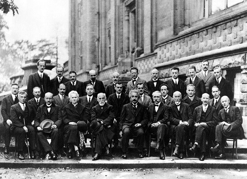
How about Bohr, Einstein, Planck, Curie, Schrödinger, Pauli, Heisenberg, Lorentz, Dirac, Compton, de Broglie, Debye, Bragg et al at the 1927 Solvay Conference:Hey dude, can you make one similar but with acclaimed scientists instead?
http://upload.wikimedia.org/wikipedia/commons/thumb/6/6e/Solvay_conference_1927.jpg/800px-Solvay_conference_1927.jpg
- Status
- Not open for further replies.